

You are using an out of date browser. It may not display this or other websites correctly.
You should upgrade or use an alternative browser.
You should upgrade or use an alternative browser.
logo review
- Thread starter hadhad
- Start date
montecristo
Top Contributor
Looks pretty good.
Being completely pedantic, I would have the .com.au aligned with the rest of logo a little better, but other than that it's nice.
Being completely pedantic, I would have the .com.au aligned with the rest of logo a little better, but other than that it's nice.
montecristo
Top Contributor
sweet man.
The logo is pretty cool, did you design it yourself?
The logo is pretty cool, did you design it yourself?
I think this is a decent logo, but in my opinion it is very technology/msn esk.
if this is a social network for lifestyle/health/cosmetics etc, something more organic and beautiful may be in order.
the shiny generic avatar icon is typical of the anonymous software user icon.
This logo has a professional finish, but this is not the logo of a unique brand. And, fair enough, many domain first, development second sites are not trying to create a strong brand, that is not the play.
I hope this feedback helps, and if you decide to keep the logo, I think that's OK.
on second review, I feel better about this logo.
It is a logo that has broad, consumer appeal, in an internet type way which certainly reflects the domain name "everybody".
I think your suggestion that this is a social network for health/beauty threw me off. If this is actually the case, I still think the logo has missed the mark.
It is a logo that has broad, consumer appeal, in an internet type way which certainly reflects the domain name "everybody".
I think your suggestion that this is a social network for health/beauty threw me off. If this is actually the case, I still think the logo has missed the mark.
marketingweb
Top Contributor
Link doesn't seem to work? Have you now removed it?
marketingweb
Top Contributor
I really like it!
I think it is a really nice logo with a web2.0 feel, without looking exactly the same as every other web2.0 logo out there - which is quite a feat.
I will say that where you would struggle with this sort of logo is in a lot of offline stuff that may not be relevant to you at all but are worth mentioning:
1) If faxing - logo very difficult to translate to one colour (i know faxing is old skool, don't shoot me)
2) On a lot of promotional products. For example, say you want to do t-shirts with your logo. Very possible, but they will cost you 3 times what a spot colour logo does, unless you do massive quantities. Something like pens - VERY expensive to print a logo like this, but I guess you would just do the web address (or not do pens at all). On the other hand something like a stubby holder or a mouse mat - no problems.
So basically, i'm a fan but I wouldn't do a logo like this for a company that didn't operate primarily online - just my opinion!
montecristo
Top Contributor
I really like it!
I think it is a really nice logo with a web2.0 feel, without looking exactly the same as every other web2.0 logo out there - which is quite a feat.
I will say that where you would struggle with this sort of logo is in a lot of offline stuff that may not be relevant to you at all but are worth mentioning:
1) If faxing - logo very difficult to translate to one colour (i know faxing is old skool, don't shoot me)
2) On a lot of promotional products. For example, say you want to do t-shirts with your logo. Very possible, but they will cost you 3 times what a spot colour logo does, unless you do massive quantities. Something like pens - VERY expensive to print a logo like this, but I guess you would just do the web address (or not do pens at all). On the other hand something like a stubby holder or a mouse mat - no problems.
So basically, i'm a fan but I wouldn't do a logo like this for a company that didn't operate primarily online - just my opinion!
You would simply do the colour in black. It would remain an easily identifiable mark.
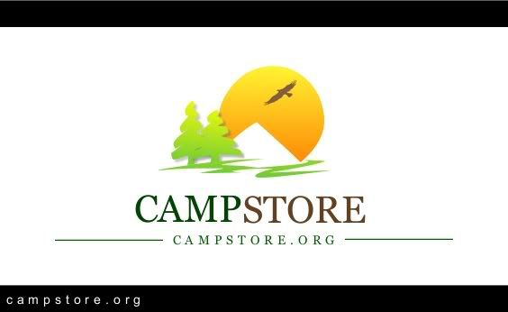
WEB:
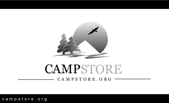
PRINT:
...
Last edited:
marketingweb
Top Contributor
You would simply do the colour in black. It would remain an easily identifiable mark.
Actually I do beg to differ, as black and white and greyscale are two very different things. The example you have shown here is greyscale, which can be done for any image. If it was as simple as that there would not be an issue for any logo ever.
If you were offset printing something (ie paper printing, on a press) and wanted to do one colour, that works fine because the dot size and ppi / dpi (dots pixels per inch) of offset is really good at around 300dpi. (Side note dpi and ppi are not actually the same thing, but it's beyond this conversation I think).
However if you faxed that logo (print it off and try it!) it doesn't come so crash hot and it would go all solid.
For textile screen printing (say a t-shirt) you are looking at around 45ppi on average, or something like pad printing on a pen, calculator, golf ball whatever is only 70dpi from memory. You CAN do logos with a tonal effect, but with the amount of detail in that greyscale example it wouldn't work super well.
Either way, as I said I really like the logo and I think it's a winner.
Last edited:
montecristo
Top Contributor
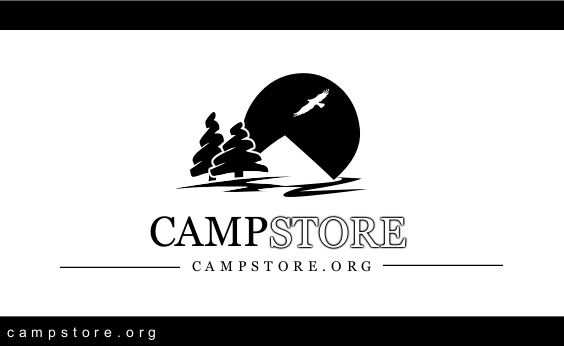
FAX:
marketingweb
Top Contributor
Yes, montecristo that definitely works, would also work for various other things. Nice job with the conversion to pure B&W.
I guess the points to take from this is with the right graphic designer (such a someone like Monte Cristo I'm thinking) it is possible to get a version of your logo for all situations. It's just important to make sure you actually do get all the versions you need rather than presuming the one version will work for everything.
I have to deal with at least a logo a week where someone has developed it in photoshop, it's not vectorised or able to be colour separated (so can't be printed in spot colours), and it just doesn't work unless you print in full colour which is expensive still on some items, although very cheap now on others. But if you start with a logo like yours and get derivative versions for other uses you will do well.
marketingweb
Top Contributor
Good luck with it hadhad, looking forward to the site.
Forgot to mention embroidary! You will never get perfect with that as gradients don't exist, but given that most machines can use up to 12 colours a skilled digitiser can normally do some pretty clever stuff you can still get a really nice result. And once it's digitised right (turned into a thread pattern for the computer to read), you will get good consistant results after that - provided you use the same people.
Forgot to mention embroidary! You will never get perfect with that as gradients don't exist, but given that most machines can use up to 12 colours a skilled digitiser can normally do some pretty clever stuff you can still get a really nice result. And once it's digitised right (turned into a thread pattern for the computer to read), you will get good consistant results after that - provided you use the same people.
Community sponsors


