FirstPageResults
Top Contributor
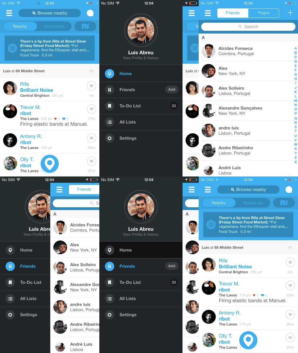
What's a hamburger menu you ask? This:

The article is referring to apps, but this is also relevant for websites:
http://techcrunch.com/2014/05/24/before-the-hamburger-button-kills-you/
A colleague also shared these stats from a Time magazine trial a short while back:

And here are some more pretty pictures that illustrate the extra effort to reach the standard hamburger menu:


(Source)
Personally I have no issue with the burger menu. Never really given it much thought tbh, but the UX and frontend developers I work with love harping on about how crappy it is..Your thoughts?

Interaction theory, A/B tests, and the evolution of some of the top apps in the world all support the same thesis: The hamburger button is bad for engagement, and you should probably replace it with a tab bar or other navigation scheme.
...
Essentially, what’s out of sight is out of mind. Any navigation options you hide behind the hamburger will be forgotten, or at least used a lot less. It doesn’t help that the button is often placed in the top left corner — the hardest place to reach when using the phone with just your right hand.
The article is referring to apps, but this is also relevant for websites:
http://techcrunch.com/2014/05/24/before-the-hamburger-button-kills-you/
A colleague also shared these stats from a Time magazine trial a short while back:
And here are some more pretty pictures that illustrate the extra effort to reach the standard hamburger menu:
(Source)
Personally I have no issue with the burger menu. Never really given it much thought tbh, but the UX and frontend developers I work with love harping on about how crappy it is..Your thoughts?
Attachments
Last edited:


