What's new

New Web Site - Dimensions

Snooks

Top Contributor
I wonder if someone could advise me of the best dimensions or size, for todays websites. Given screens are larger than in years gone by its obvious the site should be scaled accordingly.

Im figuring the experienced people on here can advise me what the most appropriate size is.

Thanks:)
 

payattention

Archived Member
If you check your analytics you'll find that most users are still browsing in resolutions around 1024 - 1280 in width. 320x480 has also been increasing due to mobile browsing and beats anything higher than 1280 on a lot of my sites.

Even though large monitors are cheaper, their use isn't as widespread when you look at the data.
 

Ash

Top Contributor
I've just set my site up as a responsive design so it scales to fit the viewport, but the base is 960px to cater for the 1024px resolution.
 

Snooks

Top Contributor
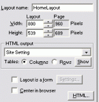
Im trying a new software (For coding dummies) and actually need to work out the best values to place in the boxes, as per the attched image.
 

Attachments

  • 08-Feb 02.02 AM.gif
    08-Feb 02.02 AM.gif
    3.6 KB · Views: 13

Snooks

Top Contributor
980 sounds great but what about the hieght. I need dimensions sideway and top to bottom:( Any suggestions.

Sorry if this is such a basic question but im trying to learn from the ground up so want the "footings" perfect.

Many Thanks:)
 

ScottNugent

Top Contributor
I work in 900px or 960px; but generally 960px. Don't need to worry TOO much about the "fold" as I certainly don't think it's as big a deal as it used to be. Nevertheless, I generally assume to the fold to be around 600px down.

There is ABSOLUTELY nothing more annoying for me than horizontal scrolling designs. So I certainly wouldn't exceed 1000px width ever.

As far as mobile, Jonathan is spot on with 320x480px. However, most phones these days scale regular (~960px) sites down for you, making it a lot less concerning for developers. You can still use browser-specific CSS if you wish to ensure a seamless display across all devices.

As a side note; have you heard of the 960 Grid System? It's a grid framework used in a lot of designs which could make things a lot less tricky for you. Take a look at 960.gs. :)
 

nina

Top Contributor
980 sounds great but what about the hieght. I need dimensions sideway and top to bottom:( Any suggestions.

Sorry if this is such a basic question but im trying to learn from the ground up so want the "footings" perfect.

Many Thanks:)

Height - there is no real 'height' specific recommendation. But let's get a bit realistic here - the home page is your '10 second commercial' whereby you have a limited amount of time for people to decide .. shall I stay or shall I go.. so, I would use a laptop screen, maybe a 1024 or 1280 res screen and some screen shots or photoshop / jpg files to visualise how much space you need to allow to 'sell the site'.

As a rule of thumb, we work on setting a priority for our information.. There is some data that is expected to be on every site, on every page, and while important, is not imperative to be up the top - eg.. privacy, terms and conditions, about us, contact us - (although the last two used to be prime information they are often shifted to lower parts of the site due to lack of space)

Is the site going to have a lot of content - can you use images or button images (with alt tags for google and useabilty) to 'pad the site out'

Generally, I try to keep home page content as reasonably uncomplicated and light to allow users to choose what they want to do next. If you can get them past the first page, you've sort of engaged them, so the rules can be bent a little, and pages can be a little longer.

I could talk all day on this - but try to look at a site from the users point of view, on slightly smaller screens, remembering there are also mobile users now and more tablet users.

I always suggest to make the text slightly larger than you think, the images slightly smaller than you think, and less words that you want to write (and that is hard for me) and prioritise in the following -

Sales/First Impression information / links
Must Have Links
Like to have links

Social networking links- My thoughts - never up the top - why advertise another website when you've got them on yours - sure put it on - but it's not a priority... put them lower.

Just some more food for thought - good luck with it all and share your progress so we can give you more tips!

Nina
 

nina

Top Contributor
I work in 900px or 960px; but generally 960px. Don't need to worry TOO much about the "fold" as I certainly don't think it's as big a deal as it used to be. Nevertheless, I generally assume to the fold to be around 600px down.

There is ABSOLUTELY nothing more annoying for me than horizontal scrolling designs. So I certainly wouldn't exceed 1000px width ever.

As far as mobile, Jonathan is spot on with 320x480px. However, most phones these days scale regular (~960px) sites down for you, making it a lot less concerning for developers. You can still use browser-specific CSS if you wish to ensure a seamless display across all devices.

As a side note; have you heard of the 960 Grid System? It's a grid framework used in a lot of designs which could make things a lot less tricky for you. Take a look at 960.gs. :)

The 960 grid system is fantastic.. I think it needs an element of skill with CSS because what happens is that you think you've got it right - until you open up other browsers. We use 960 grid / 12 & 16 is our preference.

It is the perfect tool for structured consistency.

I second what you say Scott!:D

Nina
 

Community sponsors

Domain Parking Manager

AddMe Reputation Management

Digital Marketing Experts

Catch Expired Domains

Web Hosting

Members online

No members online now.

Forum statistics

Threads
11,100
Messages
92,051
Members
2,394
Latest member
Spacemo
Top